Projects.
a more in depth look at my process, and final outcomes.






Fork It, I'm Cooking - Magazine
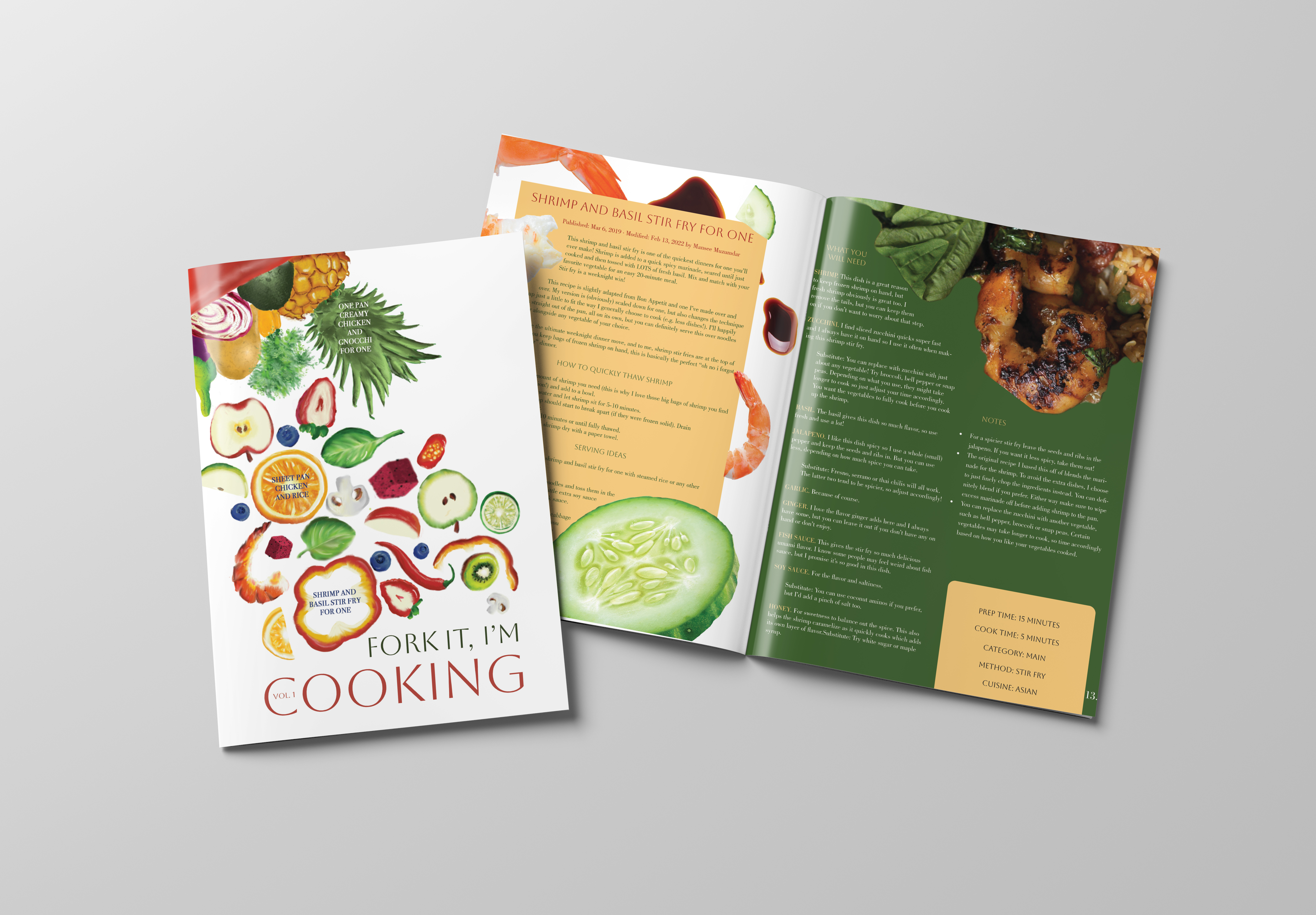
Fork It, I’m Cooking is an editorial magazine designed for college students who enjoy home-cooked meals but struggle to find recipes tailored to cooking for one. Created to make solo cooking more practical, affordable, and enjoyable, the magazine addresses common challenges such as excessive leftovers, repetitive meals, and cutting down on food waste. Through strategic grocery shopping tips, waste-reduction strategies, and easy-to-follow single-serving recipes. Fork It, I’m Cooking empowers students to make the most of their ingredients while creating meals that fit their lifestyles.

Final Specifications
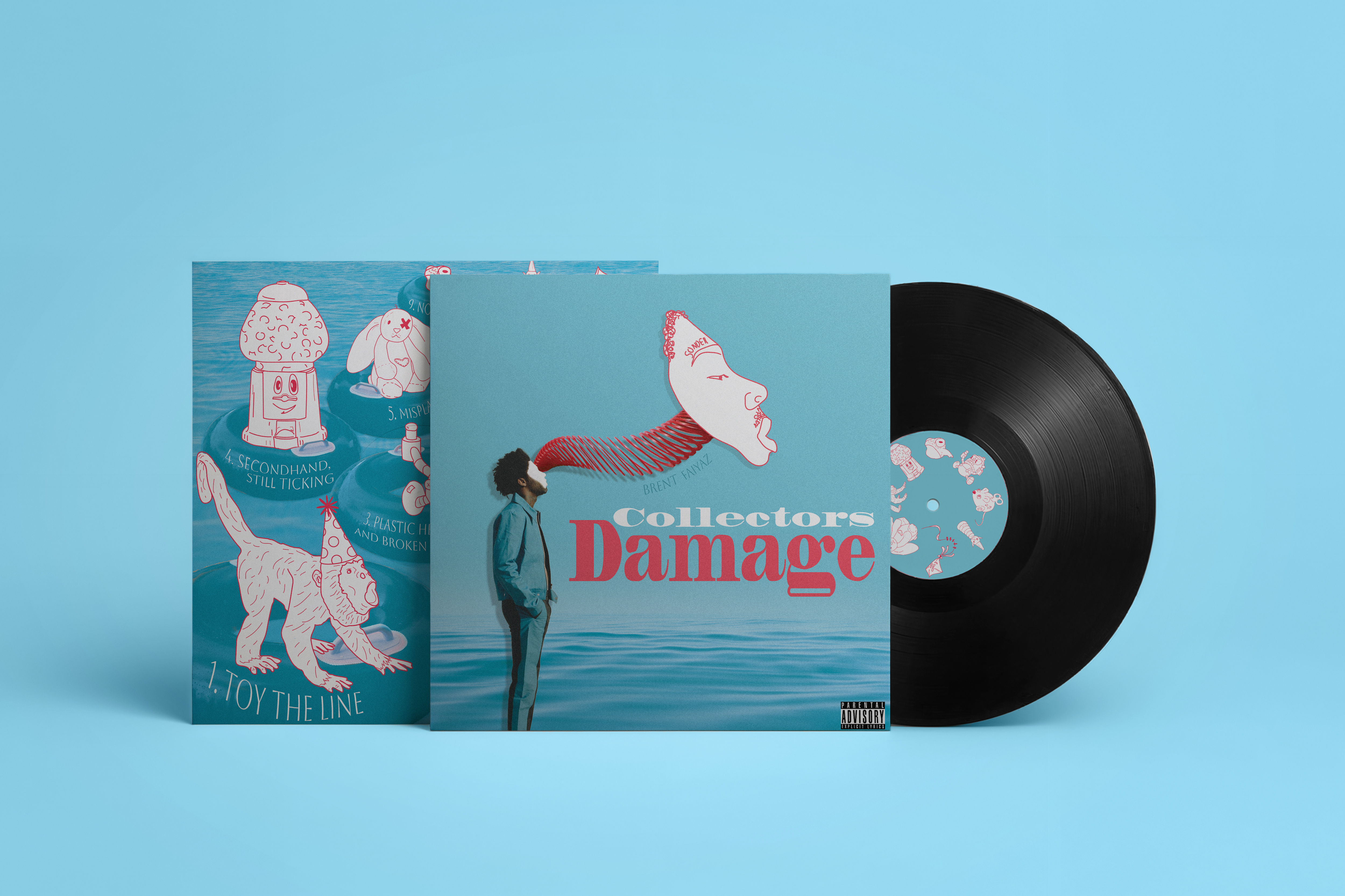
Inspired by the atmospheric and surreal visual language of Brent Faiyaz’s previous albums, Collectors Damage reinterprets his aesthetic through the lens of fragmentation and nostalgia. Drawing from the concept of the “island of misfit toys,” the project frames identity as something shaped by use, memory, and emotional wear.
The album identity combines elements of his established visual style with a shift toward illustration and distortion, replacing traditional portraiture with character-driven imagery. Themes of self-reflection and imperfection are expressed through altered forms, tactile references, and subtle irregularities that suggest both preservation and damage.
The final design presents a cohesive album concept that feels familiar in tone while introducing a more abstract and introspective visual direction.
Tracklist

Preliminary Concept Iterations
The project began with nine distinct concept directions, developed through a word-mapping exercise to define key themes and attributes for the album’s visual identity. Each direction translated these ideas into a potential cover approach, balancing alignment with Brent Faiyaz’s existing visual language while introducing a more illustrative and distorted alternative to traditional portrait-based covers.
1. Toy The Line
2. Untouched, Somehow Used
3. Plastic Hearts and Broken Parts
4. Secondhand, Still Ticking
5. Misplayced
6. No Strings, Still Attached
7. Love Sold Separately
8. Mint to End
9. No Returns

Refined Iterations
Through critique and discussion, the strongest concepts were evaluated based on composition, color, typographic structure, and cohesion with established album aesthetics. Three front cover directions were further developed, allowing for a more focused exploration of how the back cover, tracklist, and final album title could function as a unified system.


I created a series of illustrated characters in Adobe Illustrator, using real toy references as a foundation. Each figure was adapted with subtle distortions and human-like qualities, reinforcing the project’s themes of nostalgia, identity, and emotional wear. These illustrations extend beyond the cover as potential collectible inserts, designed to function as a sticker set within the vinyl packaging.
Characters

Final Specifications
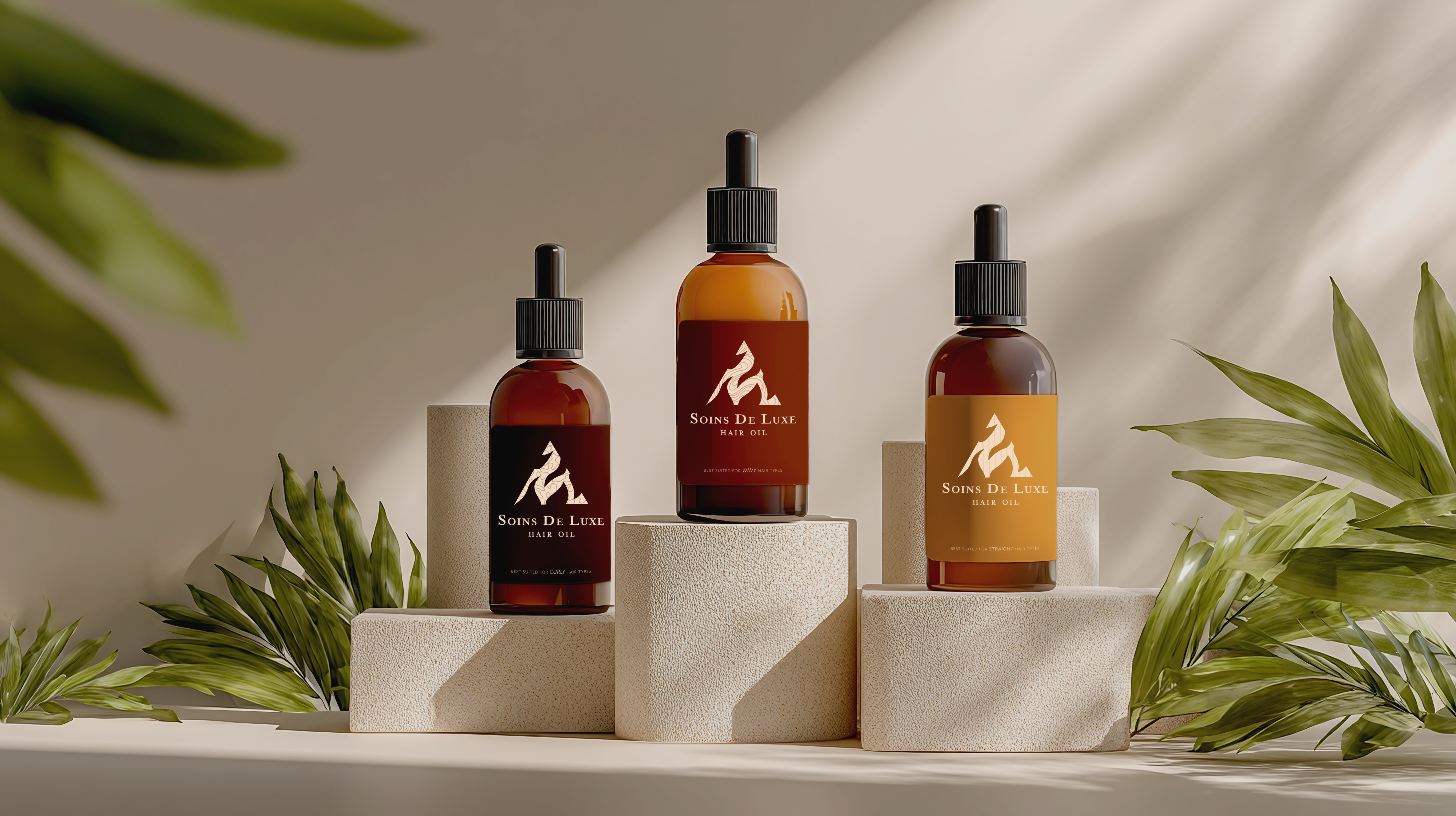
This project explores a structured visual system for a luxury haircare line, using form and color to differentiate product function and user need.
The identity is built around a series of symbols tailored to each product, designed to reflect both target hair type and stage of use. Forms transition from soft, curvilinear shapes in the shampoo and conditioner; evoking bubbles, fluidity, and cleanliness—to more rigid, angular compositions in the hair oil, suggesting dryness, tension, and repair. This shift creates a subtle visual progression across the product line.
A warm, earthy palette grounds the system, while bottle colors correspond to common hair tones and patterns reference varying hair textures. Together, these elements create a cohesive yet differentiated identity that communicates function through form rather than instruction.

Symbol Combinations
This icon system was designed for a hair-care product line, using organic patterns and a coordinated color palette to represent three distinct hair types: curly, wavy, and straight. Each pattern reflects the texture of its corresponding hair type, while the color palettes draw inspiration from common natural hair colors. The icons are organized by hair type across three products—shampoo, conditioner, and hair oil—creating a cohesive visual identity that maintains consistency throughout each product line while allowing each hair type to remain distinct.

Sketches
I created 108 sketches inspired by geometric forms (36 circles, 36 tirangles, and 36 squares.)

Digital Iterations
Following the direction of my previous sketches, I vectorized the symbol iterations on Adobe Illustrator. After 54 digital iterations, I moved back to sketching to envision how I could combine my ideas into one cohesive set.

Final Specifications
3 Preliminary Concepts
I began the design process by developing three initial concepts. For each direction, I evaluated strengths and weaknesses through a comparative analysis of positive and negative attributes to determine the most effective solution to refine and develop further.
This evaluation revealed that prioritizing original content was essential to strengthening the overall concept. Additionally, clearly communicating a shift in target audience age group became a key factor in guiding the design direction moving forward.
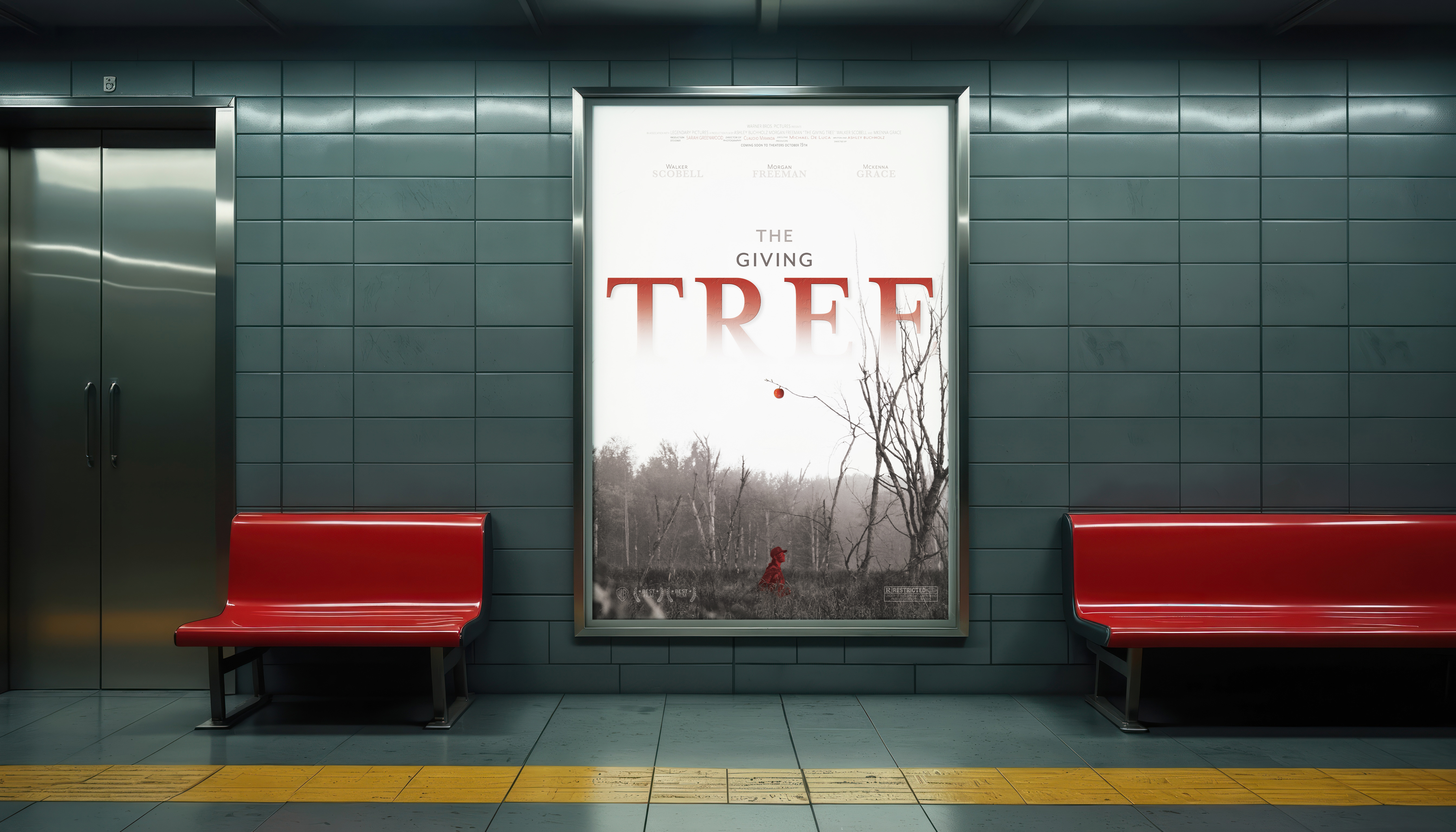
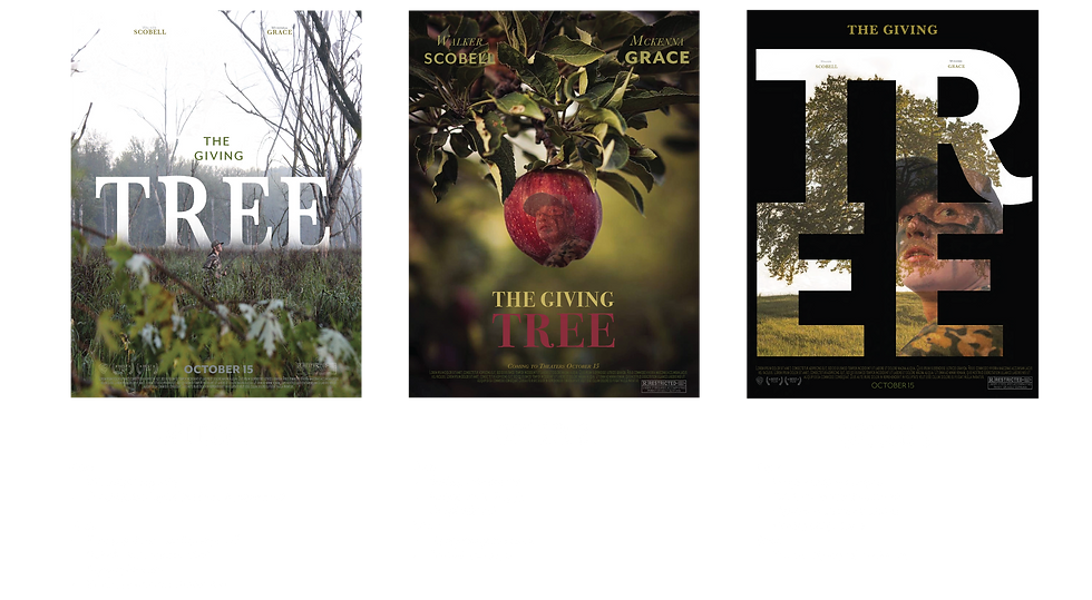
This concept is inspired by Shel Silverstein’s The Giving Tree, reimagined through a darker, cinematic lens. The original story centers on a tree that selflessly gives everything—its apples, shade, branches, trunk, and ultimately its life—to a boy who continuously takes without reciprocation, until the tree is reduced to a stump.
In my reinterpretation, I explore what this narrative might look like as a film still, focusing on themes of imbalance, depletion, and emotional aftermath. Using a photograph I captured in the swamps of southwest Wisconsin, I constructed a scene that reflects the story’s central dynamic of consumption and loss. I digitally composited a single apple onto the tree’s barren branches to serve as a focal point and symbolic remnant of what has been taken.
Through intentional use of color and composition, I direct the viewer’s attention toward this final element, emphasizing the contrast between absence and what remains.
Final Specifications
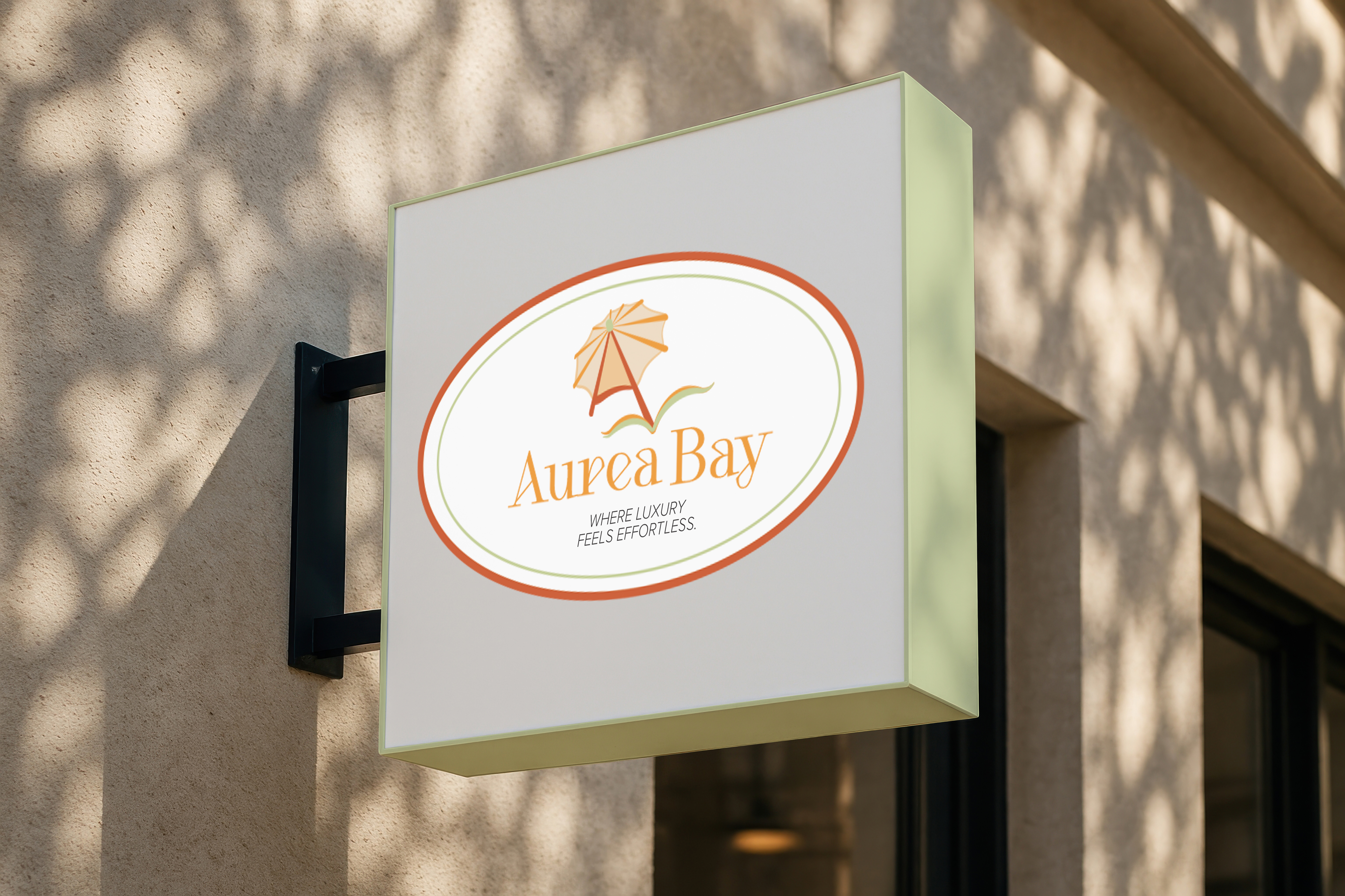
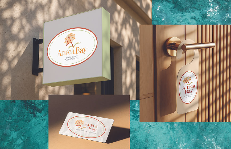
This brand identity was developed for Aurea Bay, a luxury adults-only beach resort. The name Aurea, derived from Latin, translates to “golden” or “gilded,” reflecting the concept of effortless luxury set against sandy coastal landscapes.
For the logo design, I intentionally moved away from conventional tropical resort imagery such as palm trees, suns, and seashells. Instead, I developed a more distinctive visual language that maintains a refined, high-end tropical aesthetic while differentiating the brand from competitors.
The concept draws inspiration from subtle coastal and leisure elements, including a drink umbrella, hibiscus flower, and ocean waves. These motifs were abstracted to represent relaxation, tropical ambiance, and the resort’s all-inclusive experience.
A secondary focus of the design was to emphasize the “A” letterform in Aurea, reinforcing brand recognition through typographic structure. Through intentional use of color and composition, I established a clear visual hierarchy that draws attention to the initial character of the wordmark while supporting a cohesive and elevated brand identity.

Final Specifications
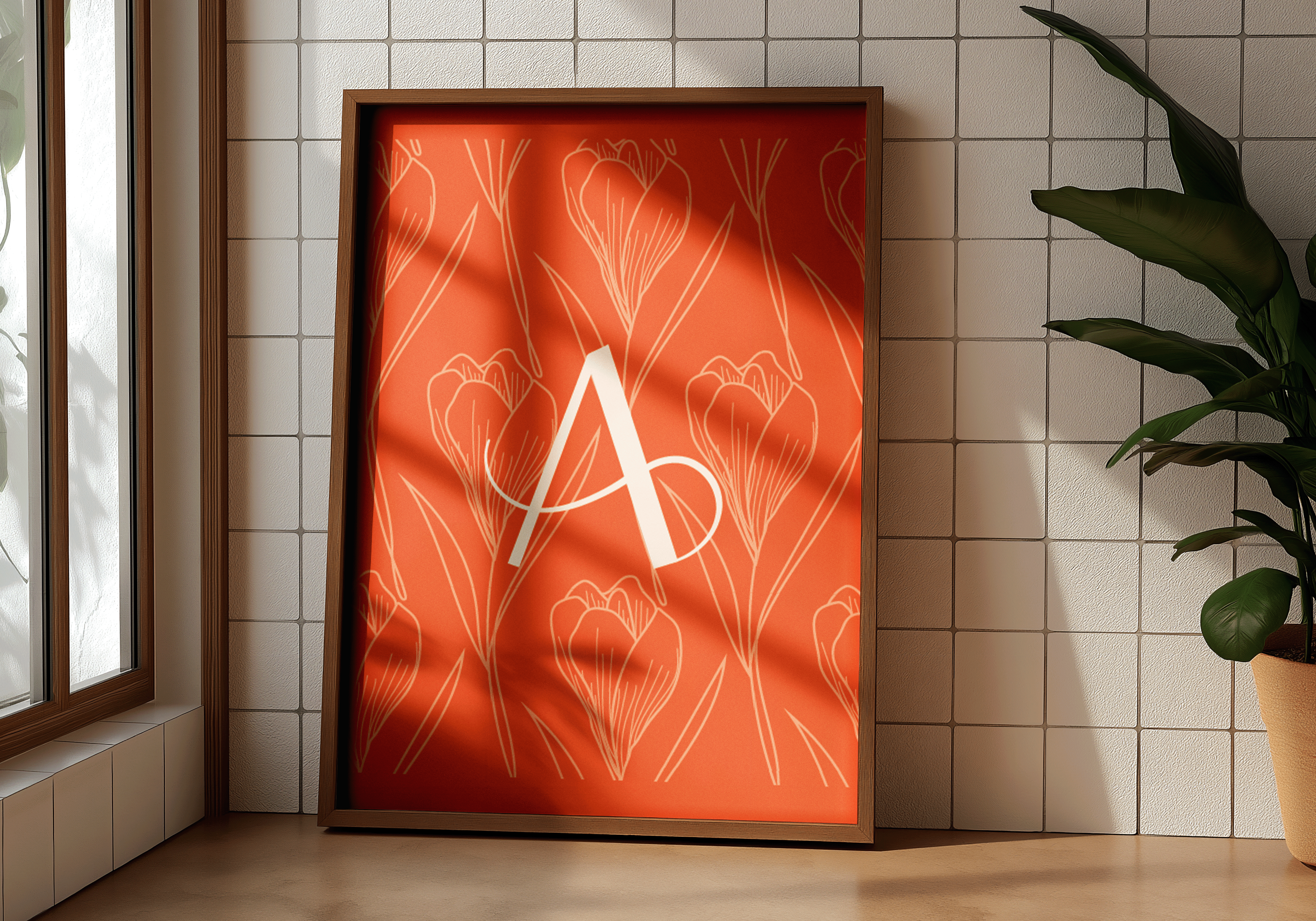
This project was an exercise in visually summarizing my identity as a designer. My goal was to translate my personal design preferences, influences, and initials into a cohesive visual mark.
The color orange is a consistent element throughout my work and serves as a key part of my visual identity.
Floral forms also play a significant role in my practice, influencing my compositions through shape, pattern, color, and structure. In response, I developed an original floral motif for my personal logo, emphasizing attention to detail and ornamental structure.
The overall aesthetic is delicate and refined, reflecting a soft, decorative quality that carries through to the typographic treatment of my initials. The “A,” representing my first name, is given greater prominence, while the “b” is more subtle, achieved through reduced scale and lighter stroke weight. Together, the forms read as my full name while maintaining a balanced hierarchy.
The final composition reflects both my design sensibility and personal style—decorative yet intentional, detailed yet approachable.
Specifications Sheet
